
A Historical Look at the 10 Largest S&P Companies
Last month I did a post on historical investment performance based on a blog article I had read near the end of the year. This is a similar one - but focusing this time on the historical mix of large companies and what it tells us - and doesn't tell us - about shifts in the overall economy over the past 40 years.
Jay LeBlanc
2/24/20265 min read
Let's start with the obvious (at least to me) - I am NO expert on the stock market. And while I try to be an informed investor for my own retirement funds, I do NOT plan on giving advice to anyone else here. So this article (and any other article on investing) is not intended to be taken as a suggestion to base financial decisions on.
I'm going to keep this one very simple - just want to look at three infographics (along with a few resources/lessons) and let you read into them whatever you will. I found the first two interesting in particular - they are presenting the same data, but organized a little differently. The third is also interesting, but I have used it more often and thought it was worth including . . .
So let's start with the first two (one below the other):
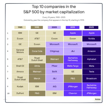
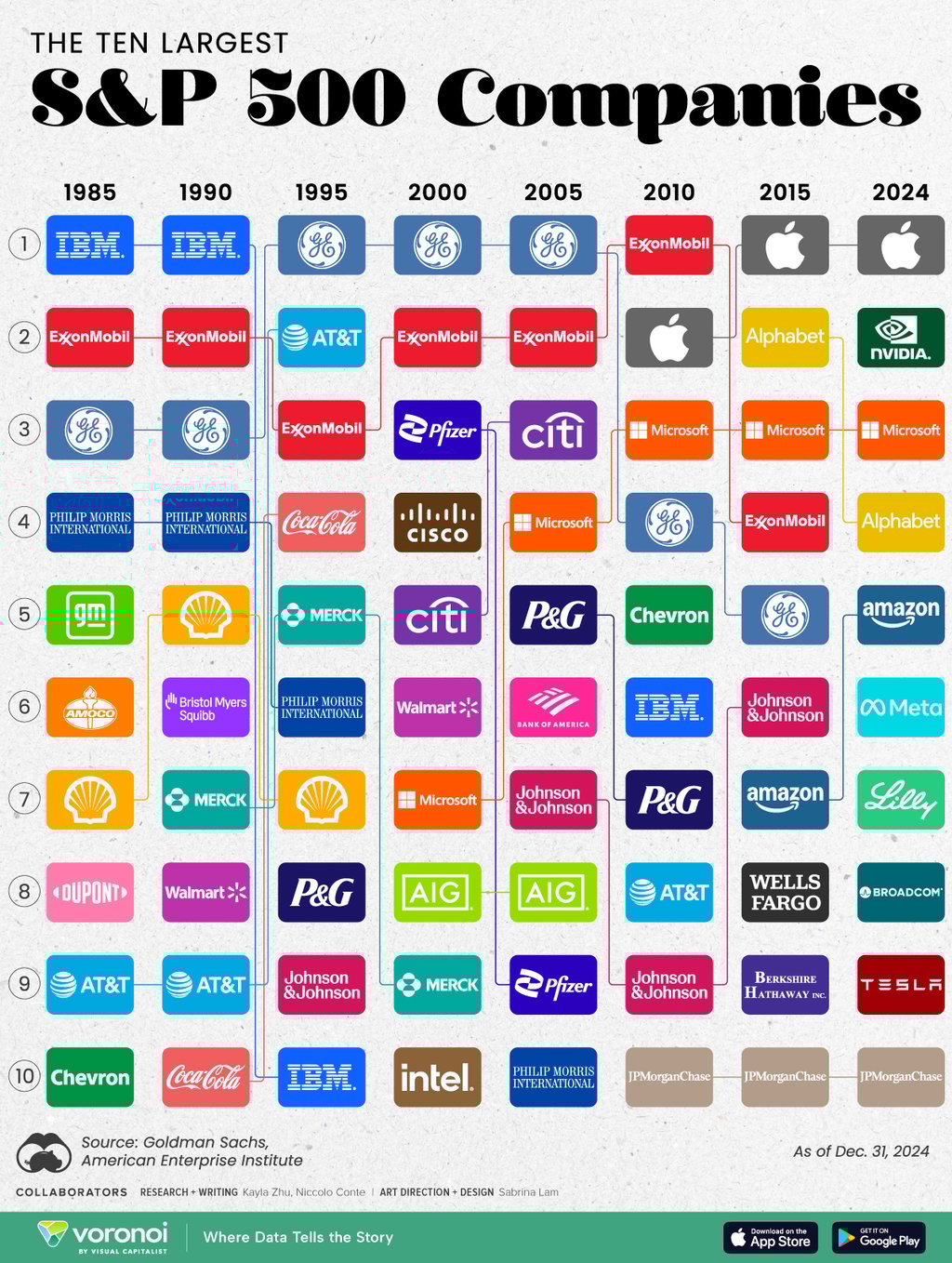
Infographics showing the Ten Largest Companies (by market cap), 1985 - 2025
I originally saw this idea presented in an Econlife post last week - Elaine was using the infographic right above this based on data from Axios. As I went exploring for more information, though, I came across the infographic at the top from Visual Capitalist and thought students would relate better to the use of icons rather than color-coding for historical continuity. Just a couple of points to make about the data shown . . .
One obvious difference between the two charts is that the top one shows the company ranking in 5-year increments, rather than the 10-year increments in the lower one. While the "big picture" doesn't change, it is interesting to see some of the subtle changes shown by the 5-year periods - for example, the rise of pharmaceutical companies in the 1990-2005 period is easier to see in the top graph (rather than the bottom one, where it looks like a "one-off" novelty).
It also gives you a chance to see some of the bigger stories in a different context. For example, it is one thing to talk about global warming and environmental change as one of many factors impacting the world economy. It is another to look at the plethora of large oil companies 40 years ago - Amoco, ExxonMobil, Shell, Chevron - and not see any of them in the Top 10 today. That doesn't mean they are not still a major part of the world economy today - or that the need for gasoline and oil has disappeared - but it is not as large a story as it once was.
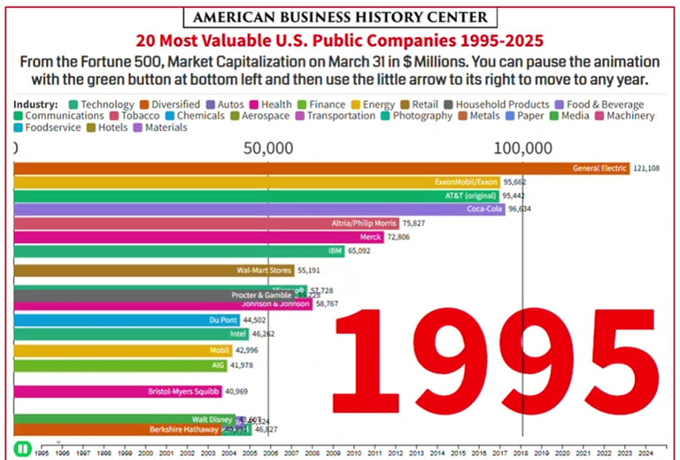
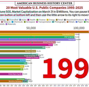
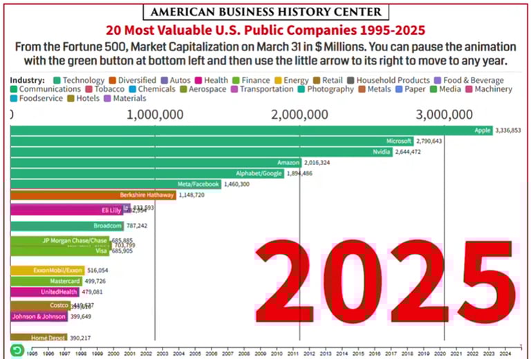
That's a good lead-in, though, to another trend I would want to point out to students. None of those companies that were highly ranked in the 1980s, 1990s, 2000s, and 2010s have gone anywhere - Coca-Cola is still selling soft drinks all over the world, IBM still makes computing equipment, General Motors still sells cars. So what happened? Those companies simply got relatively smaller compared to the size and scope of major companies today. Below are two screenshots from a YouTube presentation showing the movement over time (I wanted to include the clip itself, but it would not imbed into a post) . . .
Without getting into the details of companies (which I kept small - go to the YouTube link provided below to watch the 4-minute animation), note two BIG differences between these two snapshots in time. ONE (which students always pick up on) is the color coding - today's most valuable companies are mostly in the tech industry. That would be the infamous "Mag 7" - companies like Apple, Microsoft, Nvidia, and Alphabet/Google. But TWO, the other big difference that gets overlooked by students is the scale. Thirty years ago, the range of value between the 1st and 10th most valuable company is $120 billion down to $55 billion (so the biggest company is about twice as big as the 10th biggest).
Today that range between 1st and 10th is $3.4 TRILLION to $800 billion - so not only have the values of the companies increased exponentially (much faster than inflation over 30 years) but the biggest company is now over 4 times bigger than the 10th biggest company. If you look at the four companies that are on both top-20 lists shown above:
Exxon Mobil increased in value from $99 billion in 1995 to $516 billion today
Johnson and Johnson increased in value from $63 billion in 1995 to $399 billion today
Proctor & Gamble increased in value from $58 billion in 1995 to $399 billion today
Berkshire Hathaway increased in value from $43 billion in 1995 to $1.15 trillion today
And yet . . . all of them declined in ranking except Berkshire Hathaway - not because their companies were worse off, but simply because other companies increased their value even more (or came into existence) over the same time period.
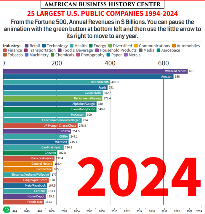
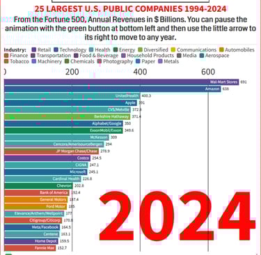
One more point to make with one more screenshot. We have been comparing value (measured as market cap) for most of these companies - but for tech companies that involves a lot of a) potential and b) intellectual property. What does this look like if we are just talking about quantifiable revenues - how much does your company actually make?
Many of the same names . . . but the order and scale are quite a bit different.

Resources Specifically Used in This Post:
"Axios Markets - February 17, 2026", Axios Markets, Feb 2026, https://www.axios.com/newsletters/axios-markets-a3e2e26e-f96a-461f-ae4b-acc48b73b601.html?
"Charted: S&P 500 Market Concentration Over 145 Years", Visual Capitalist, Mar 2025, https://www.visualcapitalist.com/charted-sp-500-market-concentration-over-145-years/
"Largest American Companies 1994 2024 Top 25" (video animation), American Business History Center, Jul 2025, https://www.youtube.com/watch?v=PTkPWeTN0aw
"Largest American Companies over 30 Years: 1994-2024", American Business History Center, Jul 2025, https://americanbusinesshistory.org/largest-american-companies-over-30-years-1994-2024/
"Most Valuable American Companies over 30 Years: 1995-2025", American Business History Center, Jul 2025, https://americanbusinesshistory.org/most-valuable-american-companies-over-30-years-1995-2025/
"Most Valuable American Companies 1995 through 2025" (video animation), American Business History Center, Jul 2025, https://www.youtube.com/watch?v=pjgS2LEEyqc
"Ranked: The Largest S&P 500 Companies Over Time (1985-2024)", Visual Capitalist, Apr 2025, https://www.visualcapitalist.com/ranked-the-largest-sp-500-companies-over-time-1985-2024/
"What We Can Learn From the S&P 500", Econlife.com, Feb 2026, https://econlife.com/2026/02/sp-500-history/
Other Resources/Lessons Available for this content:
"All stocks listed on US stock exchanges, categorized by market cap", FinViz.com, https://finviz.com/map.ashx?t=cap
"Dinosaur Age: Charting Giant Companies 66 Years Ago", American Business History Center, Jul 2020, https://americanbusinesshistory.org/40-years-of-the-fortune-500-1954-93-animated-chart/
"MOVE: Let’s Make the S&P 500" (lesson plan), NextGen Personal Finance (NGPF), Mar 2025, https://docs.google.com/document/d/19zZdyfxG2j1s02bUxhn9auRskDbuvoj5fn0jir3S6Do/edit?tab=t.0
"Question of the Day: How many of the 9 American companies worth over $1 trillion (in market value) can you name?", NextGen Personal Finance (NGPF), Sep 2025, https://www.ngpf.org/blog/question-of-the-day/4-companies-are-now-as-valuable-as-400-of-the-largest-make-up-20-of-sp500/
"Standard and Poor's 500 index stocks categorized by sectors and industries", FinViz.com, https://finviz.com/map.ashx
"What is Market Capitalization or Market Cap? A Simple Explanation for Kids & Teens" (lesson), Ea$y Pea$y Finance, Mar 2025, https://www.easypeasyfinance.com/market-capitalization-cap-for-kids-teens/
ECON and More
Curating articles for K-12 education.
CONTACT
© 2025. All rights reserved.