
More on the United Nations' revised World Urbanization Prospects report for 2025
Not going to go into too much detail in this overview - mostly want to show some examples of the resources available in the U.N.'s new World Urbanization Prospects report. I really like some of the graphics available, and could see teachers using them for AP Human Geography classes (for example) and then let interested teachers look at the report for more details.
Second Point of Emphasis - Implications for this level of urbanization worldwide:
I'm not going to go through the United Nations' entire list of key messages - they spent hundreds of pages (and analysis from a lot of scientists MUCH smarter than me!) going through their results. Below I will link you to all of those resources if you are interested. But I will mention a few here . . .
Key Message #1 - As described above, urbanization is only getting bigger (and faster)
Beyond the data you see above, another stat I found interesting is that about 60 per cent of the land converted to urban space since 1970 was formerly productive farmland. Bridging the urban-rural divide will require coordinated investments in transport, digital connectivity, infrastructure, and essential services - otherwise nations will find themselves increasingly with "shantytowns" on the outskirts of major metropolitan areas.
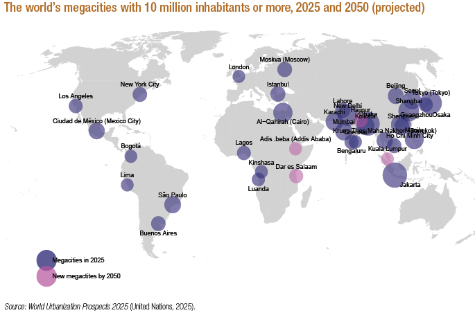
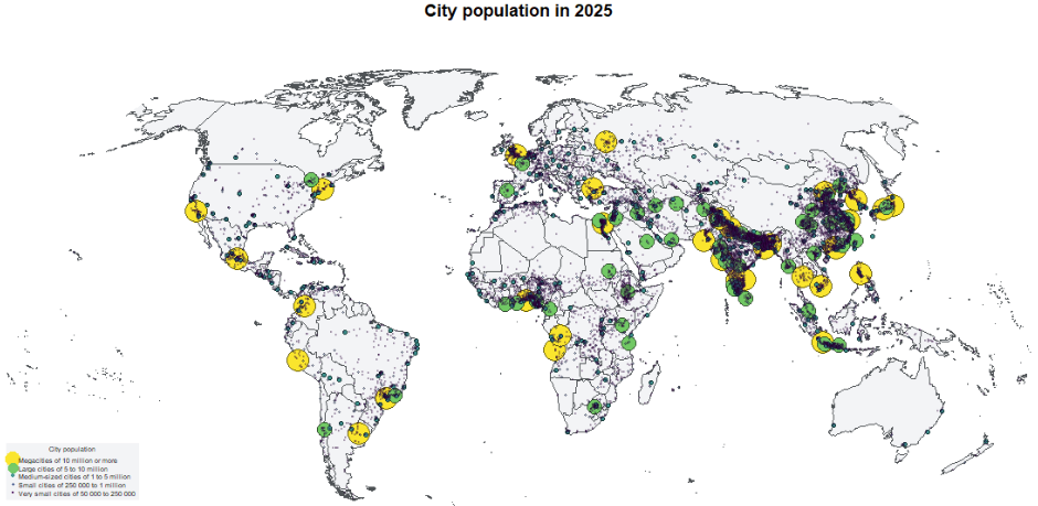
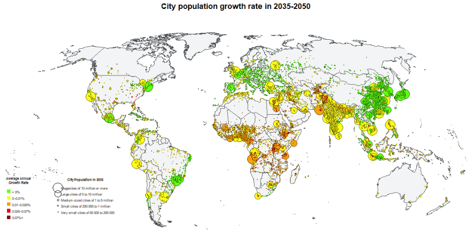
Key Message #2 - The number of “megacities” (10 million inhabitants or more) continues to grow; over half are in Asia
Let's start with a world map:
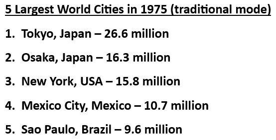
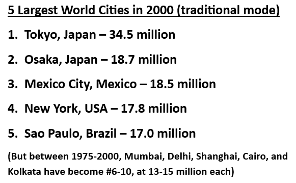
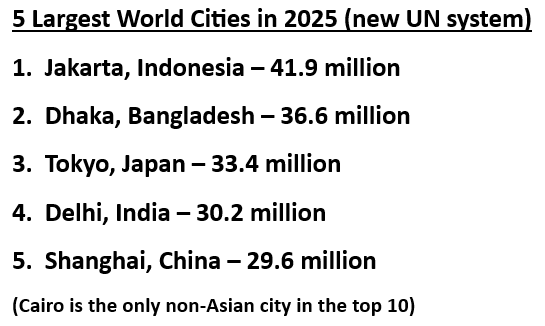
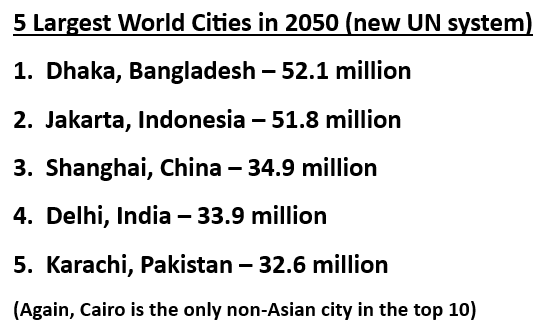
Another point the U.N. report makes, though, is not the number of these cities, but how many of them continue to grow and expand beyond current boundaries. A good way to demonstrate that is a look at the 5 largest cities in the world over different time periods (keep in mind that 1975 and 2000 reflect the old paradigm):
It is worth a reminder that people did not just "appear" out of nowhere in a city like Jakarta - instead, the change from 2000 to 2025's rankings reflect the development of consistent definitions worldwide. In the previous revision of the World Urbanization Prospects, cities were defined mostly according to country-specific definitions utilized by governments. Some countries defined their cities according to administrative boundaries, while others used definitions that encompassed broader metropolitan areas.
In the case of Jakarta, the official national statistics for the Jakarta metropolitan area excluded many of the densely populated communities that are contiguous to the Jakarta city centre (but are now included). Similarly, the populations of Guangzhou (China) and Seoul (Republic of Korea) were estimated to be roughly twice as large as previous counts, moving each of them into the top 10 largest cities for 2025.
Key Message #3 - Growth of the world's city population between 2025-2050 will be concentrated in seven countries
Over half of the projected 986 million increase in global city dwellers by 2050 will be concentrated in just seven countries: India, Nigeria, Pakistan, the Democratic Republic of the Congo, Egypt, Bangladesh, and Ethiopia. Together, these countries are expected to add more than 500 million city residents.
Key Message #4 - City population growth is uneven; most cities are growing, but thousands have shrinking populations
Worldwide, more than 3,000 cities experienced population decline between 2015 and 2025. While you might assume this is an issue of the developed world (like people moving from the Rust Belt to the Sun Belt in the United States), it is an issue worldwide. From the U.N. report: "Most of these shrinking cities have fewer than 250,000 inhabitants, with over a third in China and 17 per cent in India. These diverse trajectories underscore the need for policies that address both expansion and contraction. Growing cities must prepare to provide services for more people, while cities with shrinking populations face challenges in maintaining services and adapting their economies."
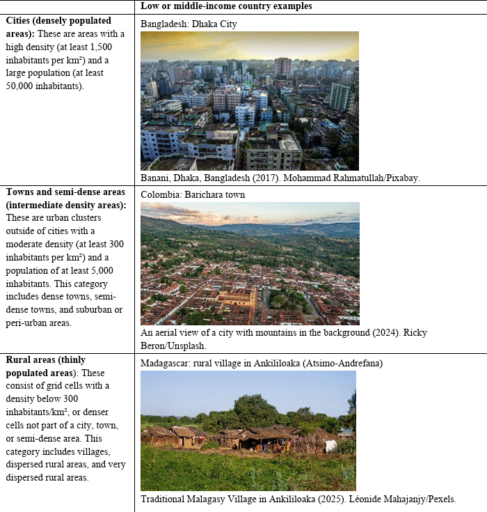
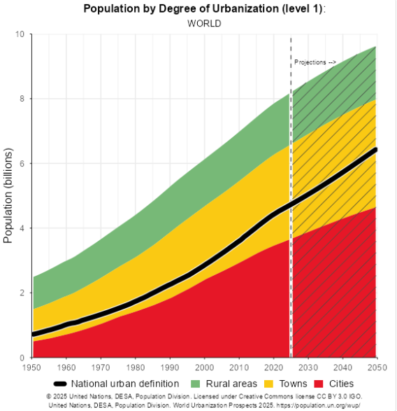
As I mentioned yesterday, this is based on a new report from the United Nations' Department of Economic and Social Affairs, and specifically their Population Division. Let's start by looking at their new common definition for urban areas, small towns, and rural areas. Before this, each nation or region of the world set their own definition (based on tradition, tax structures, or colonial systems) - now the idea is to be able to compare "apples to apples". So what does that look like?
First Point of Emphasis - New definitions provide clarity for comparisons:
From the UN report - "In 2021, the United Nations Statistical Commission endorsed the Degree of Urbanization (DEGURBA) methodology for international statistical comparisons, which complements - rather than supplants - the national definitions that countries may continue to use for their specific policy needs. This methodology provides a harmonized, spatially based framework for classifying the entire territory of a country along an urban-rural continuum, identifying cities, towns and semi-dense areas, and rural areas based on consistent population size and density thresholds applied globally.
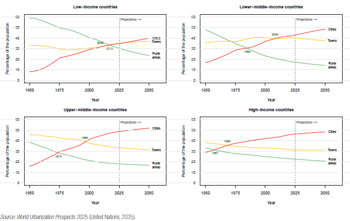
The 2025 revision of the World Urbanization Prospects adopts the definitions of cities outlined in this methodology. A “city” is defined as any contiguous geographic area with a population density of at least 1,500 inhabitants per square kilometre and a total population of at least 50,000. Within this framework, cities with more than 10 million inhabitants are classified as megacities, while those with between 5 and 10 million inhabitants are considered large cities. Medium-sized cities are defined as having 1 to 5 million inhabitants, and small cities as having between 250,000 and 1 million inhabitants. Cities with fewer than 250,000 inhabitants are categorized as very small cities." So what does that look like worldwide . . . ?
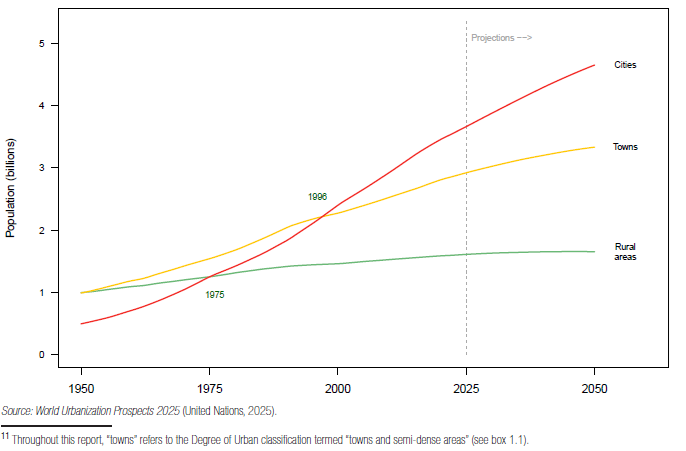
To put the chart above in some perspective:
50 years ago (1975) the world had a population of about 4 billion - about 40% in towns (5,000 to 50,000 people), 30% in cities (larger than 50,000 people), and 30% rural (villages of less than 5,000 people, farmers, and nomadic people).
Today in 2025, the world population has doubled (8.2 billion) and is comprised of 45% cities, 36% towns, and 19% rural.
Estimates say in 25 more years (2050) we will have close to 10 billion people on earth, and half of them will live in cities.
If you want to break that down further:
High-income and upper-middle-income countries in many ways already made that transition in the second half of the 20th century, with city dwellers representing close to 50% of the overall population. The main difference in rural areas often represents the impact of transportation and (lately) remote work - richer countries have people who can afford to "commute" to work in a variety of forms. What you are seeing in the top two graphs is that same kind of transition happening in large parts of the rest of the world, particularly Asia and Africa.
Third Point of Emphasis - a LOT of "Cool Tools" Available:
Like dealing with tools like the Federal Reserve's FRED (for U.S. economic data), there is so much stuff available in these tools that I could probably make several more posts on them (but I don't plan to). A few I want to point you toward, though . . .
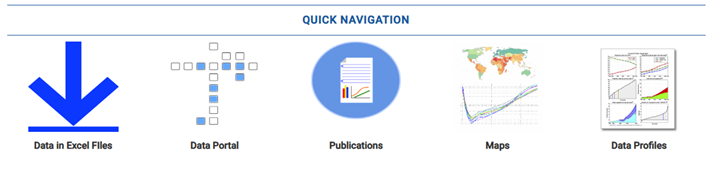
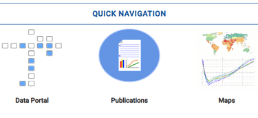
This is the main navigation menu for data from the World Urbanizations Project. You will probably not want (or need) to use the two icons on the left - the "Data in Excel Files" downloads thousands of pages of collected numbers for use in research projects, and similarly the data portal limits how much of that collected data you ask for (like a continent or even specific country) but it is still a lot of data on topics you and your students will probably not be interested in. Instead, let's focus on the three options to the right side:
Publications
Most of the pre-defined reports listed there are the same ones listed below in the resource links, with two exceptions you "might" find useful. First, it does bring up data collected from the previous revisions in 2018 and 2014, in case you want that for comparison. However, keep in mind that comparison is difficult because of the change in definitions mentioned extensively above. Still, it is available. Second, if you want to look in more detail at the methodology used to collect and analyze the data, there are two reports (a methodology report and a longer FAQ report that mostly focuses on questions about the process). Otherwise that middle icon is just a convenient way to get to the full report or executive summary.
Maps
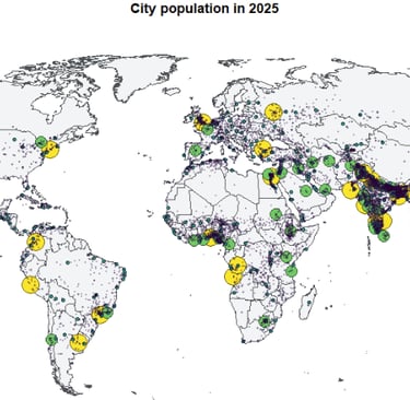
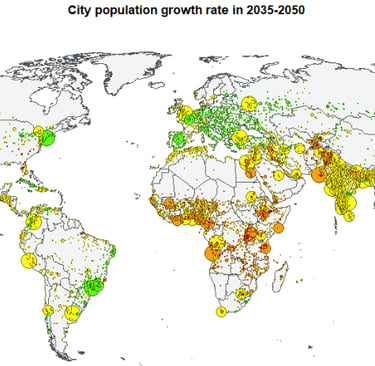
Under this tab are a number of pre-defined world maps showing visual representations of the data - historical, current, and projections of future growth based on the estimates in the report. It focuses on four aspects: 1) straight population; 2) growth rates; 3) population density (how many people per square mile, for example); and 4) city built-up area (so how much land is covered within the city, and how much farmland has been lost to be repurposed for city needs). Let me show you just a couple of examples below:
Again, these maps are pre-defined (so one topic on a single map), but there are many maps to choose from representing multiple time periods.
Country Profiles
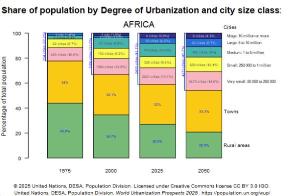
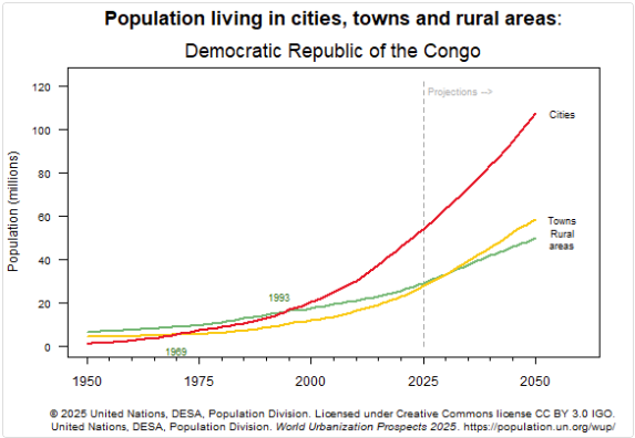
Finally, the most flexible data representations are available in the final icon on the very right. Here you can look at worldwide data, see it visually by continent, region of the world, or specific country. I showed you a couple of worldwide ones in the first point of emphasis above (the line graphs showing city, town, and rural change over time), but here are a few more examples:
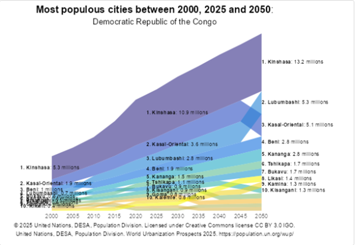
On the left is the same type of data as earlier for the world (city, town, and rural population) except this time it is shown as a total number of people (rather than a percentage), and designed to show rate of increase over time. On the left it has been broken down to just focus on the continent of Africa, with bars showing the percentages of rural (green), towns (dark yellow), and cities (all other colors, broken into sizes of cities). Below, you will see the same kinds of comparisons for a single country, the Democratic Republic of the Congo (one of the fastest growing countries in the world). The country as a whole is on the left - a city breakout on the right.
You can make this as big or small as you want (in terms of scope) - though the smaller the country the less change will typically be seen over periods of 25 years. So looking at Tuvalu in Oceania, for example, might show a noticeable urbanizing effect on a small island, but not a major part of the bigger story.
Below, as always I have provided links to the pre-defined reports, and then a link to this portion of the site (in case you want to experiment, rather than just accept what has been created already.
Resource Links for Pre-Defined reports
Main page for the Population Division of the United Nations' Department of Economic and Social Affairs, United Nations, https://www.un.org/development/desa/pd/
Main page for the World Urbanization Prospects 2025 project, Population Division of the United Nations' Department of Economic and Social Affairs, https://www.un.org/development/desa/pd/world-urbanization-prospects-2025
"Ten Key Messages" from the World Urbanization Prospects 2025 report (think of it like an executive summary), https://www.un.org/development/desa/pd/content/world-urbanization-prospects-2025-ten-key-messages
"Summary of Results" from the World Urbanization Prospects 2025 report (this is the big downloadable report - about 125 pages - with lots of tables and formulas), https://desapublications.un.org/publications/world-urbanization-prospects-2025-summary-results
"The World's Cities in 2025 Data Booklet", United Nations Department of Economic and Social Affairs, 2025, https://www.un.org/development/desa/pd/sites/www.un.org.development.desa.pd/files/undesa_pd_2025_data-booklet_world_cities_in_2025.pdf
Resource Link for Make-Your-Own charts/graphs:
"2025 Revision of World Urbanization Prospects", United Nations' Department of Economic and Social Affairs, Population Division, Nov 2025, https://population.un.org/wup/
ECON and More
Curating articles for K-12 education.
CONTACT
© 2025. All rights reserved.