Two New Resources from Visual Capitalist and the International Monetary Fund (IMF) on the Size and Shape of the Global Economy
A quick look at two new resources. One, an infographic from Visual Capitalist, tries to capture the relative size of the global economy in a single image. The other, the 2026 update of the IMF's "World Economic Outlook", focuses this year on the ongoing trade-off between "guns and butter". Plus as usual, some lessons and resources to supplement . . .
Jay LeBlanc
5/7/20265 min read
I'm going to keep this one simple - mostly I want you to just want to look at the first infographic (to see if it is something you would find useful in a larger format) and then some screenshots of interesting pieces of data from the IMF's new report. I also listed a few lessons and articles further below if you want more on either the size/scope of the world economy OR the traditional "guns or butter" economic trade-off.
So let's start with the infographics:
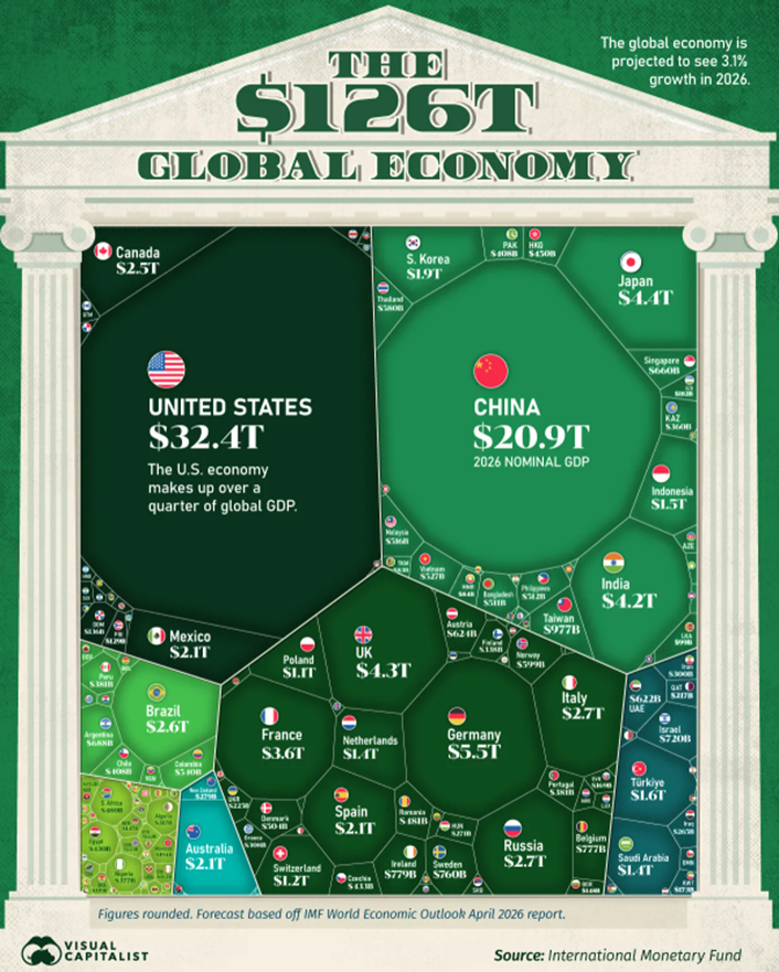
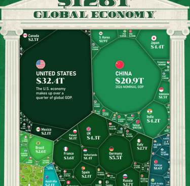
Infographic showing the $126T Global Economy Broken Down by Country (and also Continent), based on April 2026 data from the IMF's World Economic Outlook report
I have seen this kind of data about the global economy before, but normally in table form and not presented graphically like this where you can make easier comparisons to students. This was created by Visual Capitalist (just featured a couple of days ago) and I have provided a smaller version above. But I would encourage you to go to their website - with the link provided below - to be able to zoom in and examine specific areas of the world. I particularly like the way this also connects well with my geography blog series on countries of the world - it is one thing to provide per capita income data, but another to do the multiplication (per capita income x population = GDP) for a real comparison. I could expand on this extensively, but will limit myself to a few points below about the data shown (even if you can't see some of it in this smaller version) . . .
I'm going to ignore the "elephants" in the graphic - yes, the U.S. and China are obviously bigger than everyone else - and look at regional powers instead. For example (since I just covered some of these countries in European geography) it is interesting to note how much larger Germany's economy is than its' EU "teammates" like France, Italy, or Spain (the next 3 largest). I also find it interesting to look at the relative size difference between social democratic countries used as exemplars by progressive politicians (Sweden, the largest Scandinavian economy, is #12 in Europe) and compare to a U.S. economy 40 times larger. Outside of the western world, note the size of the other BRICS nations - Brazil, Russia, India, and South Africa all show signs of upward movement, and the 2024 expansion of that organization to countries like UAE, Egypt, and Saudi Arabia shows even more potential for the next 25 years.
It is also interesting to look at countries with lower per capita incomes and compare that approach to the overall size of the economy. Countries like Indonesia, Vietnam, and the Philippines have sizable economies, but with populations over 100 million each there are a lot of mouths to feed. It is also a good opportunity personally to put aside some incorrect assumptions when I see the numbers displayed graphically to compare nations around the world. For example, I don't think of Israel having the 3rd largest economy in the Middle East - all the attention typically goes to oil-rich nations. Or here in North America Canada and Mexico always get compared to the large U.S. economy . . . but do you think of both nations having larger economies than South Korea? But of course South Korea has more well-known brand names . . . not to mention K-POP!
Finally, because I used the classic Council for Economic Education lesson "Why Are Some Nations Wealthy?" for years in my classroom, I think in terms of comparisons between neighboring countries and why one becomes more successful or prosperous than another. For example, going back to Europe and Asia it is interesting to see how former Soviet republics and countries behind the Iron Curtain are developing economically 35 years later. Or the classic comparisons like Dominican Republic vs Haiti, or Singapore and Taiwan vs larger Asian neighbors. Or more recent examples, like comparing Columbia to Venezuela, or DR Congo to a smaller country like Angola or Cote D'Ivoire. Which is why a graphic is a good "hook", but we also need more specific data to examine . . .
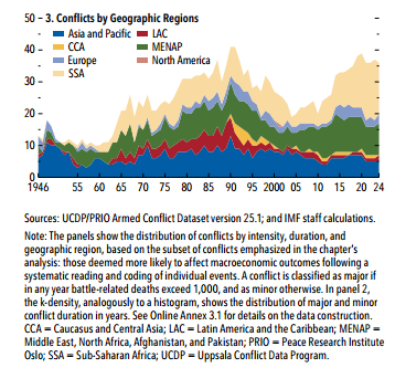
Big picture-wise, this PDF report from the International Monetary Fund provides the details about where the world economy is currently, and where they think it is going in the next 3-5 years.
As you can see from the title (they focus on different themes each update), their main focus for this year is the conflict with Iran and the implications of it on trade and growth in various countries outside the immediate conflict. Beyond that, they also discuss a little bit about the classic "guns vs butter" dilemma, asking whether countries arming to deal with potential conflict has to take something away from the optimal civilian use of resources (either in the form of cuts in spending or increases in debt).
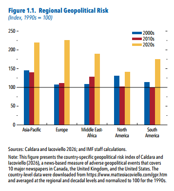
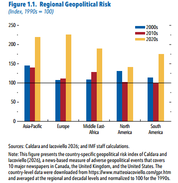
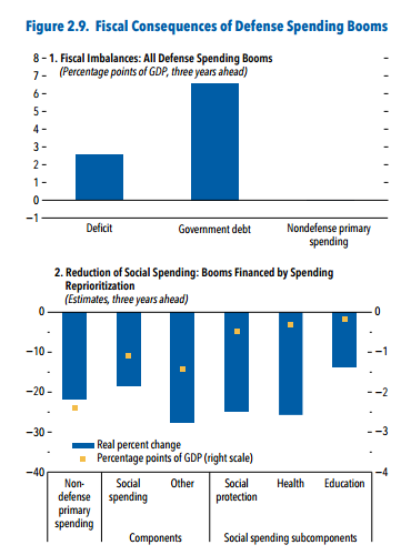
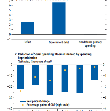
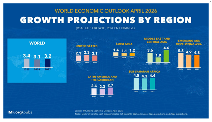
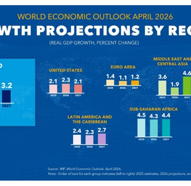
I am not getting into too many of the details (this report is way longer than the scope of this post) but gets into some interesting discussion points for a classroom. Here are three screenshots, followed by a video from Crash Course on the Production Possibilities Frontier and how countries make those kinds of decisions . . .


Resources Specifically Used in This Post:
"The $126T Global Economy in One Giant Chart", Visual Capitalist, May 2026, https://www.visualcapitalist.com/the-126t-global-economy-in-one-chart/?mc_cid=ee4deae964&mc_eid=41b133ec77
"IMF Data Mapper graphics to go with the 2026 World Economic Outlook", International Monetary Fund, May 2026, https://www.imf.org/external/datamapper/datasets/WEO
"Specialization and Trade: Crash Course Economics #2" (video), Crash Course, Jul 2015, hhttps://www.youtube.com/watch?v=NI9TLDIPVcs
"World Economic Outlook 2026: Global Economy in the Shadow of War", International Monetary Fund (IMF), Apr 2026, https://www.imf.org/en/publications/weo/issues/2026/04/14/world-economic-outlook-april-2026
World Economic Outlook series, International Monetary Fund (IMF), https://www.imf.org/en/publications/weo
Other Resources/Lessons Available for this content:
"Guns, Butter, and Dr. Seuss: Using Political Cartoons to Teach the PPC", Journal of Economics Teaching, 2018, http://downloads.journalofeconomicsteaching.org/2/2/2-2.pdf
"The Production Possibilities Frontier: Increasing Opportunity Cost" (video w/assignment), Federal Reserve Education, Dec 2016, https://www.federalreserveeducation.org/teaching-resources/economics/scarcity/the-production-possibilities-frontier-increasing-opportunity-cost
"Production Possibility Frontier (PPF): Purpose and Use in Economics", Investopedia, Mar 2026, https://www.investopedia.com/terms/p/productionpossibilityfrontier.asp
"The Puzzle of Growth: Rich Countries and Poor Countries" (video w/assignment), Marginal Revolution, Feb 2016, https://mru.org/courses/principles-economics-macroeconomics/wealth-of-nations-economic-growth OR https://www.youtube.com/watch?v=u5P8AZRBLac (for just the video)
"Understanding the Guns-and-Butter Curve and Its Economic Impact", Investopedia, Feb 2026, https://www.investopedia.com/terms/g/gunsandbutter.asp
"Why Are Some Countries Rich and Others Poor? (reading w/lesson), Federal Reserve Education, https://www.federalreserveeducation.org/teaching-resources/economics/growth-and-fluctuations/why-are-some-countries-rich-and-others-poor
"Why Are Some Nations Wealthy?" (lesson), Council for Economic Education, https://www.econedlink.org/wp-content/uploads/2022/12/Mystery-Nations-Lesson-10.pdf
ECON and More
Curating articles for K-12 education.
CONTACT
© 2025. All rights reserved.